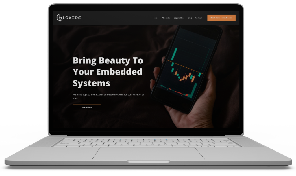
Bloxide.com is a technology company specializing in software solutions for embedded systems. The website serves as a hub for showcasing services, engaging potential clients, and establishing thought leadership in the industry. However, the existing website faced usability, visual hierarchy, and engagement challenges, leading to a need for a complete UX/UI redesign.
Roles & Responsabilities
UX/UI Designer
User research, wireframing, prototyping, visual design, usability testing
Tools Used: Figma, Adobe XD, HTML/CSS, JavaScript
Problem Statement
Challenges Identified
Navigation Issues: Users struggled to find key information due to a lack of hierarchy and clarity in the navigation structure.
CTA Visibility: The primary call-to-action (CTAs) buttons were not prominent enough, leading to lower conversion rates.
Typography Inconsistencies: The website’s text lacked clear visual hierarchy, making it hard for users to scan and absorb information quickly.
Form Usability Issues: The contact and subscription forms were cluttered, lacked spacing, and had no error validation, causing friction in the user journey.
Repetitive Content & Blog Structure: The blog section displayed duplicate articles with placeholder text, reducing credibility and engagement.
Competitive Analysis
Analyzed tech and software development websites to identify best practices for UX, CTA placement, and content structure.
Observed how competitors used visual hierarchy, whitespace, and interaction design to enhance usability.
User Research & Testing
Conducted usability testing on the original website.
Key pain points identified:
Unclear forms leading to confusion.
Weak CTA contrast reducing conversions.
Dense typography making content hard to read.
Navigation not intuitive, requiring too many clicks to reach important pages.
Solutions & Design Process
Navigation & Information Architecture
Streamlined the menu structure for better accessibility.
Added breadcrumb navigation to improve user flow.
Created a fixed sticky navbar for better access to key sections.
CTA Enhancements
Repositioned key CTAs above the fold.
Increased button size & contrast for better visibility.
Applied hover effects & micro-interactions for improved engagement.
Visual Hierarchy Adjustments
Increased heading font sizes
Improved line-height and font weight for better readability.
Used consistent typography across sections for a cohesive look.
Final Outcome & Results
Navigation: Easier to find information with a streamlined menu.
Forms: Clearer, more intuitive fields with better conversion rates.
Typography: Improved readability and scannability of content.
CTAs: Stronger placement and contrast, leading to increased engagement.
Blog Section: More structured and engaging for readers.