Christian apps were strong at Bible content but weak at fellowship, accountability, and ongoing relational support.
Case study
BelieverHub
A fellowship platform for the Haitian Christian diaspora, designed around real relationships, prayer accountability, small groups, and church-led density instead of passive content consumption.
I shaped the differentiation, beachhead audience, IA, visual identity, design system, and phased handoff model.
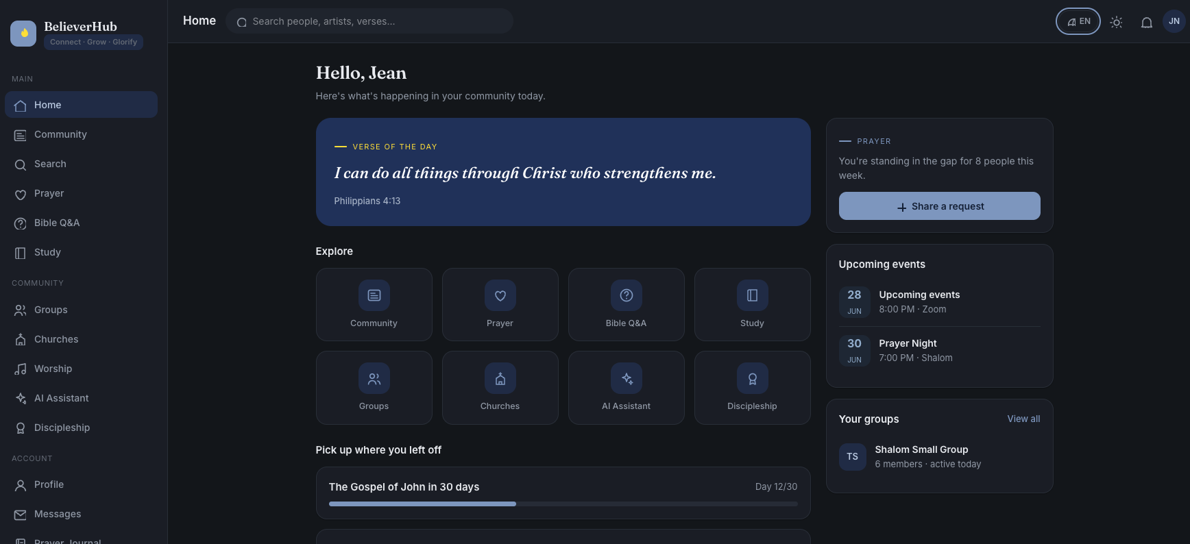
The product is centered on groups, prayer, accountability, and church-led density rather than a generic faith content feed.
The result is a complete design direction with 17 screens, tokens, dark mode, i18n architecture, and implementation rules.
My contribution
- Defined the strategic wedge: YouVersion helps people read the Bible; BelieverHub helps people not walk alone.
- Built the information architecture around fellowship, prayer, groups, Bible support, worship, messages, profile, and admin moderation.
- Created the design token system, bilingual EN/FR structure, dark mode rules, and developer handoff documentation.
Challenge
Most Christian apps optimize for solo consumption: reading, listening, highlighting, and content discovery. But the underserved gap is relational accountability: knowing someone is praying for you, staying connected to a small group, and feeling less alone in faith.
The product also needed a beachhead that large incumbents could not copy easily: the Haitian Christian diaspora, with language, culture, and church context shaping the experience.
Research insight
I mapped the faith-app landscape across two axes: solo to relational, and content to accountability. Incumbents clustered around digital, solo, content-first experiences. The open space was digital fellowship: groups, prayer, accountability, and visible support.
- Relationship, not content: the product needed to solve spiritual isolation, not compete as another Bible reader.
- Specific community: building for the Haitian, Francophone, and Creolophone Christian diaspora created a defensible wedge.
- Local church alignment: the product strengthens church relationships instead of replacing them.
Strategy
Competitive mapping showed incumbents clustered around solo, content-first experiences. Digital fellowship and accountability was the open space.
The cold-start strategy is to seed one Haitian church at a time so small groups feel alive instead of scattered.
The MVP focuses on auth, groups, prayer, and feed before expanding into the full long-term vision.
Product architecture
Home, Community Feed, Prayer Center, Groups, and AI Bible Assistant create the relational center of the experience.
Bible Q&A, study plans, devotionals, memory verses, notes, prayer journal, and notifications support ongoing rhythm.
Churches, ministry, discipleship, messages, profile, search, and admin moderation make the product manageable beyond the MVP.
Key decisions
Prayer requests use "I'm praying" with a live counter and face-pile, making support visible and relational instead of transactional.
A fellowship product needs density. The go-to-market starts with real church communities instead of isolated global signups.
A responsive installable web app avoids app-store friction, supports church-led sharing, and stays lighter for slower mobile data.
Design system
- Defined a sacred but modern identity with navy, steel blue, grey, and a disciplined yellow accent.
- Created a signature verse moment: navy card, white editorial serif, italic verse treatment, and yellow accent rule.
- Used Fraunces for headings and verses with Inter for UI, making the product feel devotional without losing usability.
- Designed dark mode, WCAG AA targets, visible focus rings, reduced-motion support, and contrast rules from the start.
Constraints as UX
Bible text must come from licensed APIs with attribution instead of hardcoded translations.
The assistant should cite real verses, show disclaimers, defer to pastors, and never invent doctrine.
Private prayers, journals, DMs, and music rights required data-layer privacy and external audio links instead of hosted content.
Developer handoff
The handoff was structured so implementation could inherit the design logic instead of recreating decisions from screenshots.
- Design tokens for color, type scale, spacing, radii, light mode, and dark mode.
- A complete navigable HTML model of the product surfaces as the visual source of truth.
- A persistent knowledge file covering product vision, roles, rules, design tokens, and implementation constraints.
- A phased prompt sequence: frontend first, backend later, Row-Level Security from day one.
Selected product direction
Outcome
BelieverHub is a 0-to-1 design and strategy case study through active development handoff.
- Defined a defensible product position around fellowship rather than content consumption.
- Created a complete IA with 17 screens and a phased MVP that can be built lean.
- Turned licensing, AI accuracy, music rights, privacy, and security into design inputs instead of late-stage risks.