Project Overview
They want to create an agency within an agency – ‘Tribal|Design’. that should be a revenue-generating department when they are not part of a larger project. By creating ‘Tribal|Design’, an independent, stand-alone entity separate from TribalScale, they will utilizing their designers, generating more interest and more revenue
Roles
User Research
Interaction Design
UI Design
Audience
New clients looking for design services, leveraging the success of the TribalScale brand
Stakeholder Interview
During the interview with the Associate Director of Tribalscale, I realise that the company is made up of approximately
– 70% development
– 10% sales
– 10% design
– 10% Administration
And their Highly skilled Design team is Under-utilized, that’s why they want a website that highlight their Design Services
User Research
Diving into research, I conducted 8 one-on-one interviews. they are all entreprenors, 50 % already hire a Design Agency and 50 % want to hire one.
User Expectation
When they go to Design Agency website they want to see:
– Portfolio
– Previous work
– Previous companies
– Capabilities
– Self navigating website
– User friendly website
– Contact
Competitive Feature Analysis
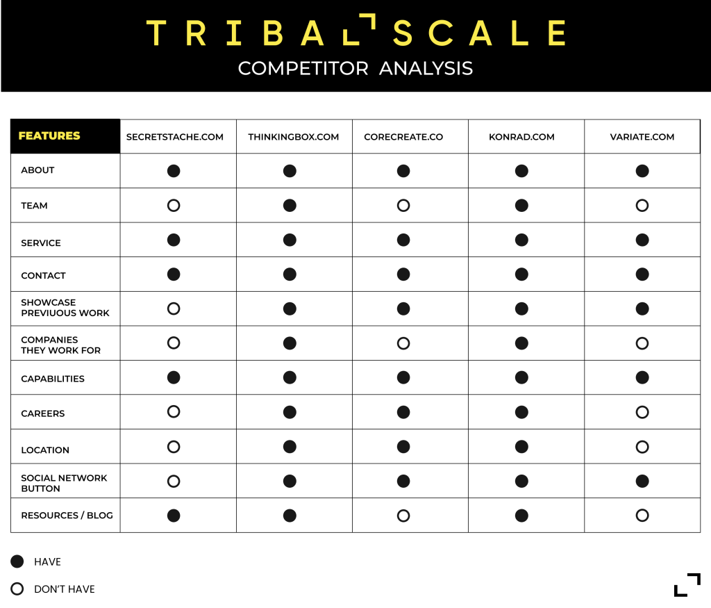
I conducted competitive research to find out what type of features other design agencies were including in their websites and what services they are offering in the market, so I chose 5 digital agencies to analyze in depth to know what I will need to include in my website design so that Tribal Scale can outshine the competition and meet the needs of my audience.


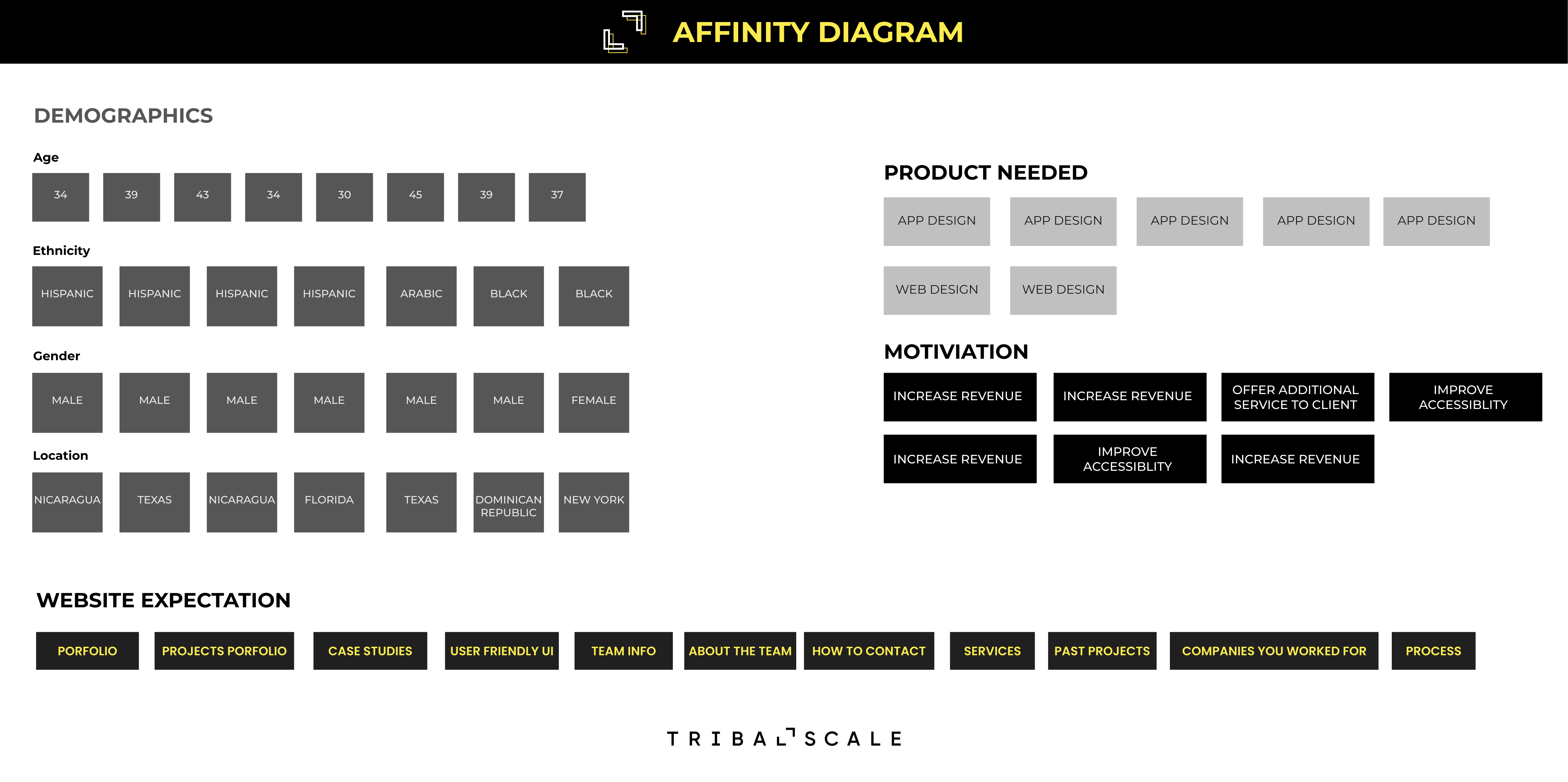
To help me extract insights and data points from my research I created an affinity diagram.
The affinity diagram helped me hone in on the most recurring pain points of my research by creating a clear visual of them.

User Persona
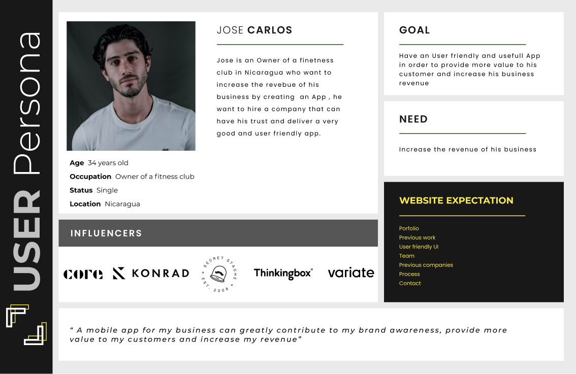
In order to remind me who my users are and helps me get in their shoes to empathize with them, Base on my research I create this User Persona as representation of my Ideal user.

Problem and Hypothesis statement
To identifies what is going to be changed and the action’s potential outcome, as well as why I think the change will have that particular result I created this “Hypothesis Statement”
Problem
TribalScale is a digital innovation firm that helps enterprises adapt and thrive in the digital era. The company has an opportunity to increase its revenue stream by showcasing and offering a multitude of design services to its clients.
how might we (HMW)
How Might We help TribalScale highlight their design services on their website in order to attract new users and garner their trust.
hypothesis statement
We believe that creating a website that showcases TribalScale’s services in an engaging and concise way will prompt potential clients to reach out to the company. We will know we are successful when the revenue & clients from the Design department are increase.
Ideation & Minimum Viable Product
Based on the quantitative data and qualitative customer feedback that I have from my audience, I brainstormed ideas on potential features and functionalities that my app will need to solve the problem. I grouped them into 4 categories using the Moscow Method.
The ideas in the “Must haves” and “Should haves” section will go on to make the Minimum Viable Product, that’s mean they will be in my website.

Site Map
With the insights that I have from the process so far I created a simple site map to shows the main pages the website will have along with the type of content the users can expect from each page.

Midfi Prototype
Based on the insights I have from the different stages in the process, I wireframes digitally the concept. I tested it to make sure it was as concise and usable as possible.
Hi-Fi Prototype
The prototype demonstrates how a user is allowed to go to about and service page of the website in an efficient and self-navigating way
