Project Overview
The objective of this project was to design a wellness app focused on promoting healthier lifestyles. I chose diet as the core topic due to its vital role in supporting overall health and well-being. A balanced diet not only improves nutrition but also helps prevent various chronic diseases such as heart disease, diabetes, and cancer
Roles
User Research
Interaction Design
Branding
UI Design
User Research
To gain deeper insights, I conducted interviews, focusing on understanding the challenges people face in maintaining a consistent diet, despite recognizing its importance for their health. The questions aimed to uncover the reasons behind these difficulties and identify common barriers to staying on track.
People's Goals
- Maintain overall health
- Sustain a healthy weight
- Achieve weight loss
- Establish long-term healthy habits
Competitive Feature Analysis
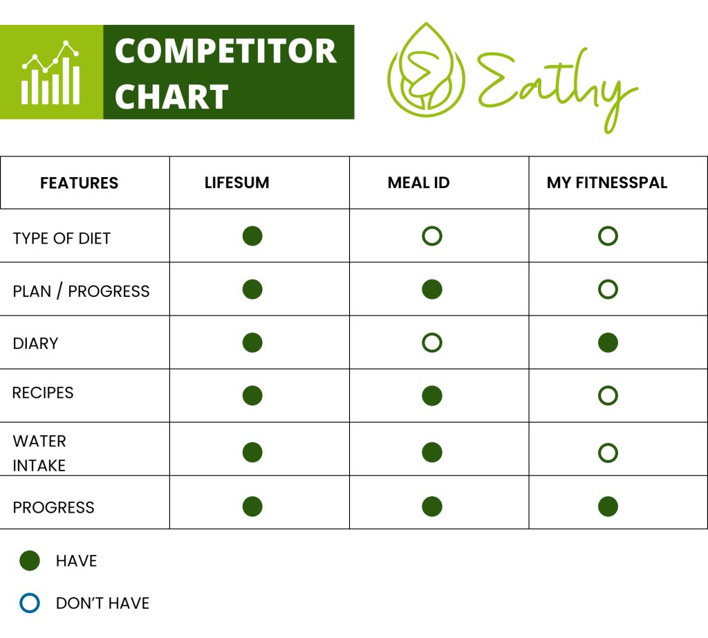
To understand the competitive landscape, I analyzed popular wellness apps currently on the market. This research helped identify key features and strategies necessary to stay competitive. The apps I selected for comparison were Lifesum, Meal ID, and MyFitnessPal, which serve as direct competitors.
Affinity Diagram
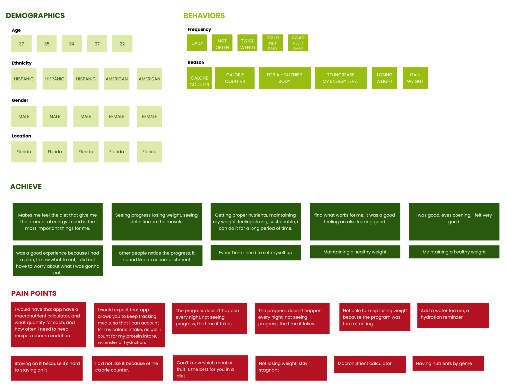
To organize insights and data from my research, I created an affinity diagram. This method allowed me to visually group recurring pain points, providing clarity and helping me focus on the most common challenges identified during user interviews. It served as a valuable tool for synthesizing research findings.
User Persona
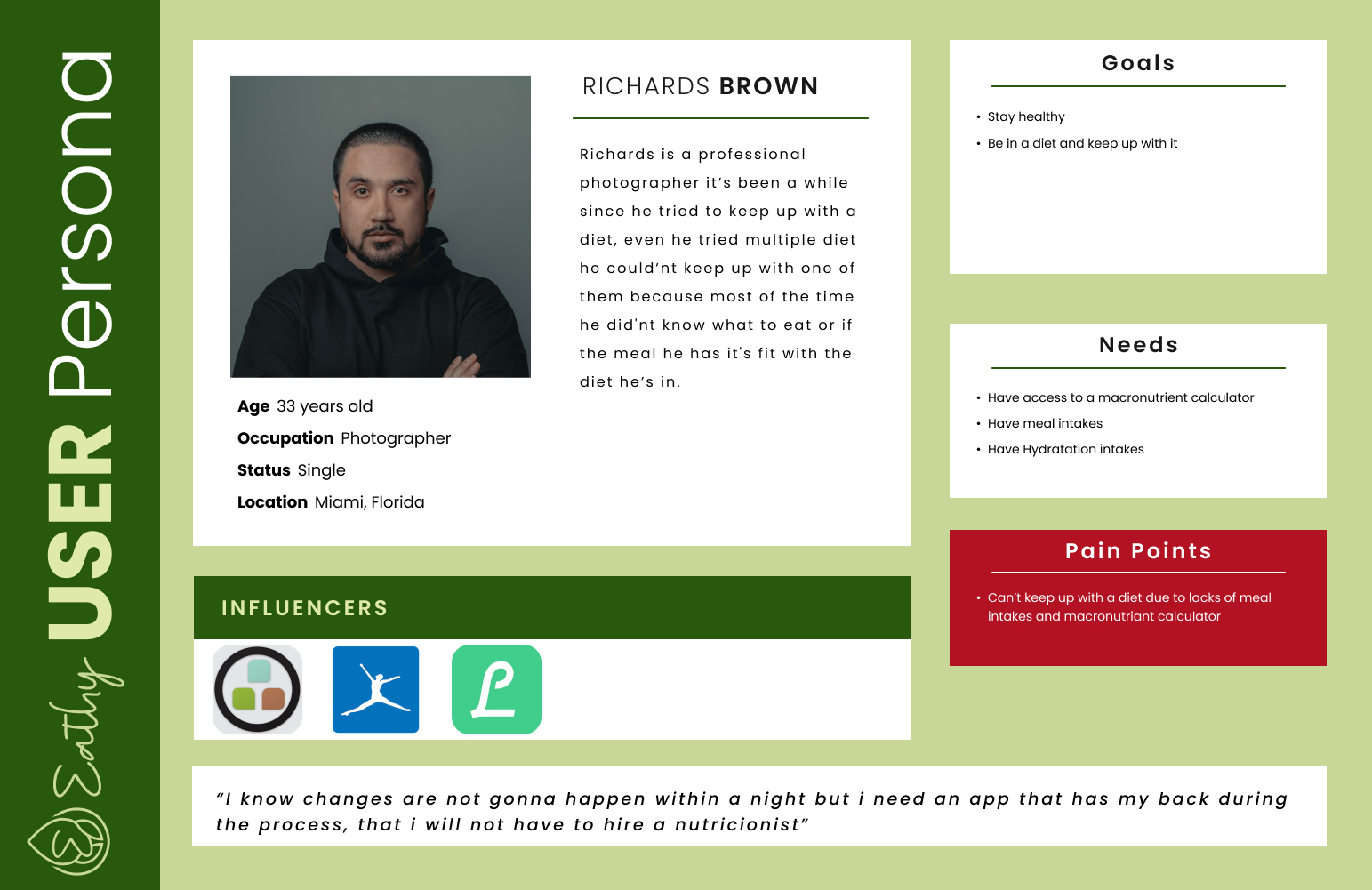
To keep the users at the forefront of the design process and to foster empathy, I created a user persona based on my research. This persona serves as a representation of my ideal user, helping to guide design decisions and ensure the solution meets their needs and goals.
User Journey Map
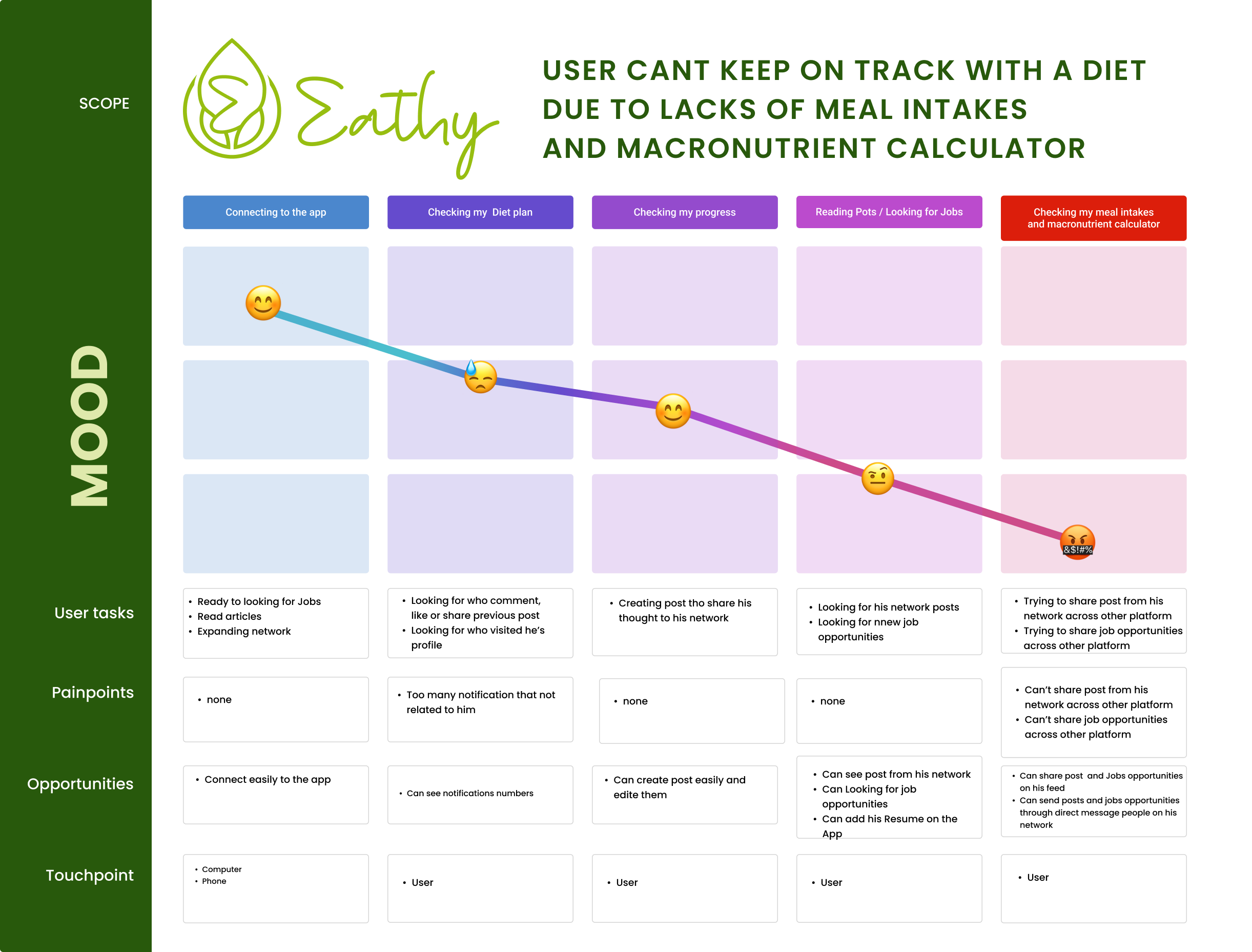
I mapped out the experience of Richard, a representative user, as he navigates the challenges of maintaining his diet. This visualization highlights his steps, pain points, and emotions throughout the process, offering key insights into areas where the app can provide support and improve his journey.
Problem and Hypothesis statement
To identifies what is going to be changed and the action’s potential outcome, as well as why I think the change will have that particular result I created this “Hypothesis Statement”
Problem
A healthy diet is essential for good health and nutrition. It protects you against many chronic noncommunicable diseases, such as heart disease, diabetes and cancer. We have observed that many people can’t keep up in a diet because most of the time they don’t know what to eat
how might we (HMW)
How Might We help peoples whi can’t stay on track with their diet due to lacks of intakes and macronutrients calculator through the app
hypothesis statement
We believe that creating feature that give users meal intakes and macronutrient calculator will help him stay on a diet. We will know we are successful through a survey when they users reports that the features help them stay in a diet, we will know we are unsuccessful if the data we gather through the survey tell us that the feature did’nt help the users.
Ideation & Minimum Viable Product
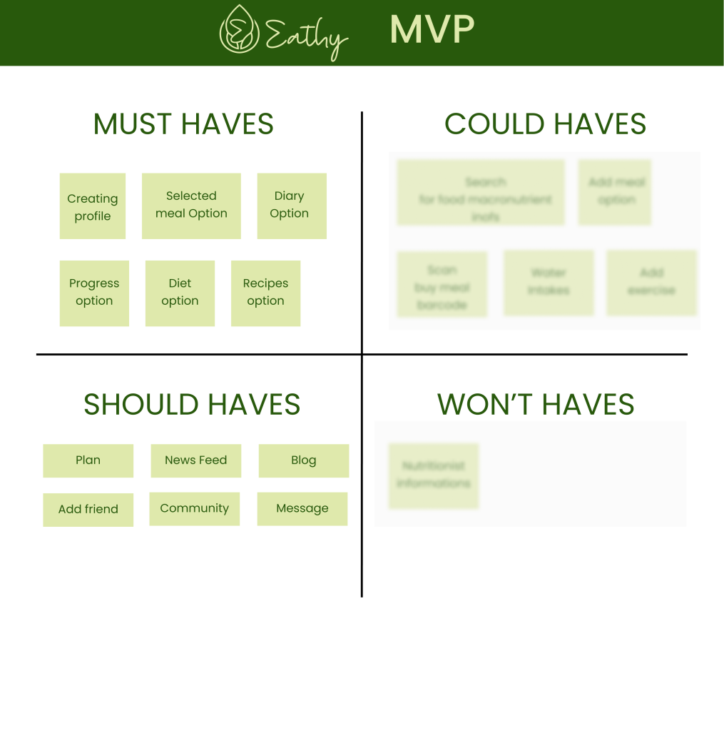
Based on the quantitative data and qualitative customer feedback that I have from my audience, I brainstormed ideas on potential features and functionalities that my app will need to solve the problem. I grouped them into 4 categories using the Moscow Method.
The ideas in the “Must haves” and “Should haves” section will go on to make the Minimum Viable Product, that’s mean they will be in my app.
User Flow
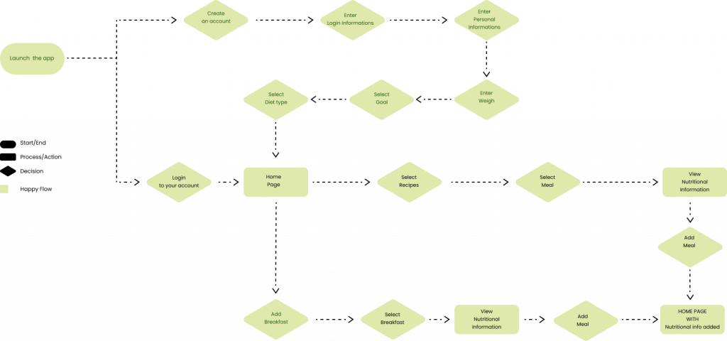
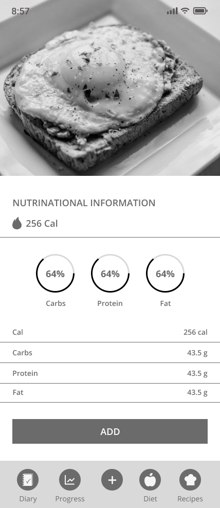
To help me visualize the structure of the App, I mapped out the main flow, or “Happy Path”, that users would take in order stay on track with their Diet, they’ll be able to choose their daily meal and have Nutritional Information about them.
Lo-Fi Sketches
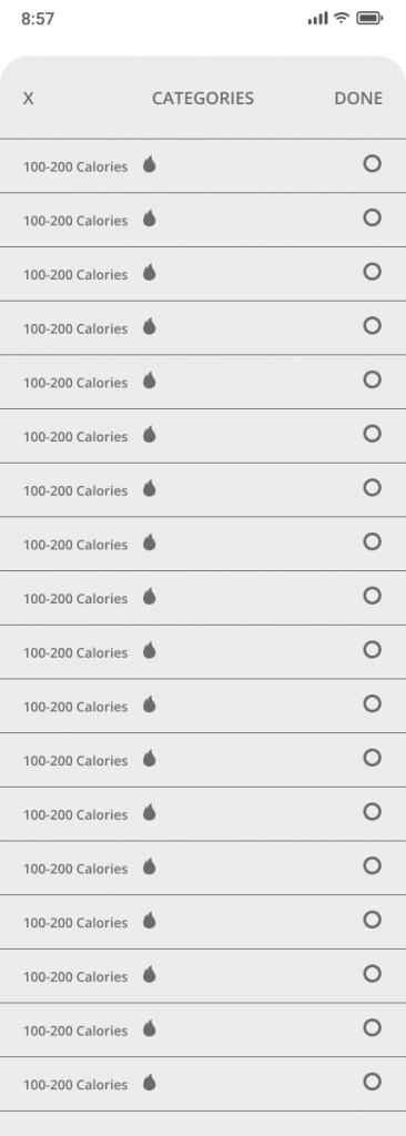
Based on the different stages outlined in the user flow, I put the concept down on paper. Using the sketches, I tested the flow and terminology to make sure it was as concise and usable as possible.

Mid-Fi Wireframes
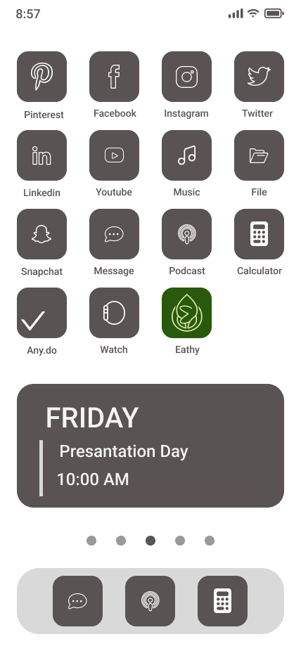
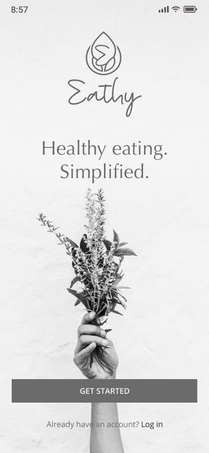
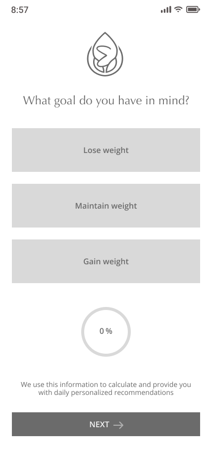
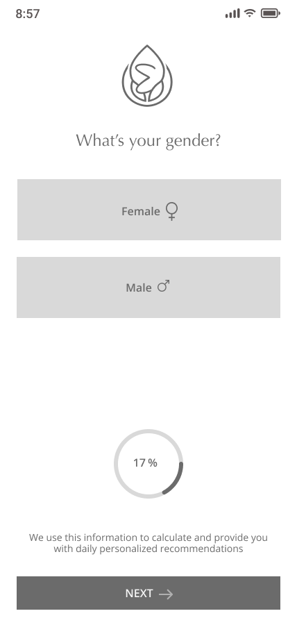
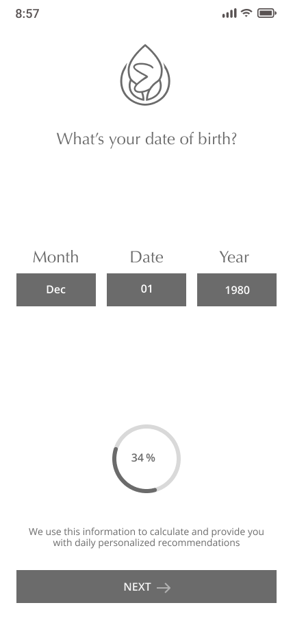
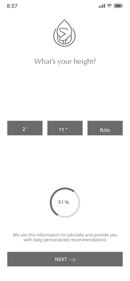
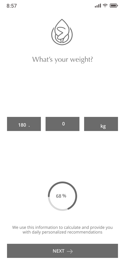
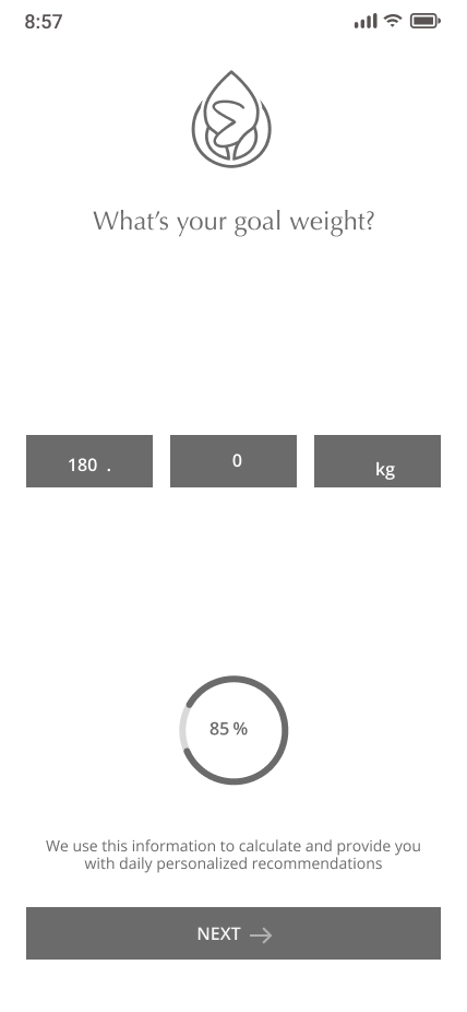
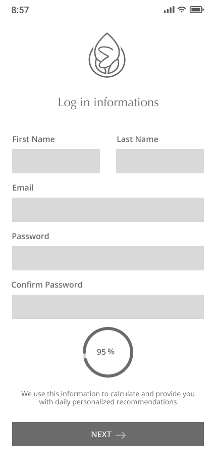
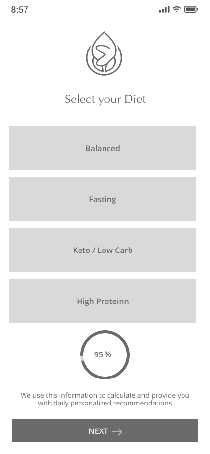
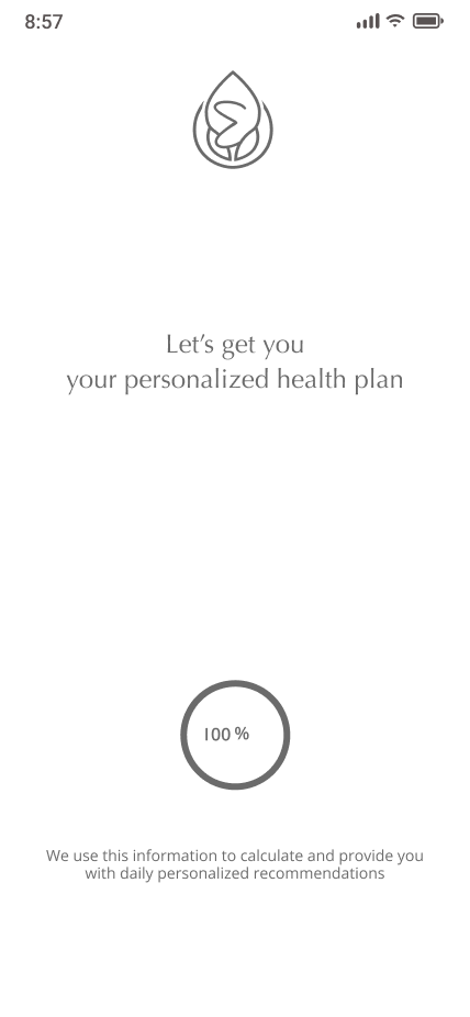
With the data I gathered from the testing, I improved the original flow and implemented the changes as digital wireframes. After testing and iterating,



Moodboard
After I defined my brand verbally, I had to make sure that the emotions I intended to capture would resonate with our users. To do so, I put together a mood board to move past the original concept and begin visually defining the brand.

Hi-Fi Prototype
The prototype demonstrates the “Happy Path” we allow users to track the nutritional information about their meal, we provide them intakes, propose them recipes and they’ll be able to choose their meal by calories.
App responsiveness
